Appearance
Pricing Analytics
The Pricing Analytics dashboard shows whether your pricing strategy is filling seats and generating the revenue it should. Use it to identify which tours are under or overpriced, understand which pricing rules are helping or hurting, and track how far in advance your customers book.
Access it from Dashboard → Pricing Analytics. Use the date-range selector to view any of: Last 7 Days, Last 30 Days, Last 90 Days, This Month, Last Month, or Last 12 Months.
TIP
For meaningful analysis, use Last 90 Days or Last 12 Months wherever possible. A 7- or 30-day window can swing wildly from just a few bookings. Longer windows reveal genuine patterns rather than noise.
What this dashboard covers
A few things worth knowing before you read any number:
Tours only. This dashboard covers guided tour bookings. Rental revenue and utilisation are reported separately.
Excluded bookings. Cancelled bookings and fully refunded bookings are excluded from all metrics. Bookings with a confirmed, paid, in_progress, or completed status are included.
No-shows. A booking that was confirmed but the customer did not show up still counts as a sold seat in fill rate calculations, because the seat was held and committed.
All booking channels. Direct bookings, walk-ins, phone bookings, and OTA bookings (GetYourGuide, Viator, and others) are all included. OTA bookings are counted at the gross price, before channel commission.
Add-ons. Add-on revenue (helmets, e-bike upgrades, photo packages, etc.) is handled differently across sections — each section notes this where it matters.
Currency. All prices are shown in your account's configured currency.
Price vs Fill Rate Over Time
This chart overlays three metrics across the selected time period to show whether your pricing is tracking demand.
| Series | What it represents |
|---|---|
| Avg Base Price (grey dashed) | The standard per-seat price before any dynamic adjustments or discounts, excluding add-ons |
| Avg Final Price (solid blue) | What customers actually paid per seat after all pricing rules — also excluding add-ons |
| Fill Rate (light blue, right axis) | Percentage of available seats sold, 0–100% |
The left axis shows price in your currency. The right axis shows fill rate as a percentage. Add-ons are excluded from both price lines so the chart reflects your base and dynamic pricing decisions in isolation.
How to read it
The gap between Avg Base Price and Avg Final Price tells the story of your pricing rules:
- Final Price above Base Price — premiums (seasonal, weekend, last-minute, capacity) are adding revenue above your standard rate.
- Final Price below Base Price — discounts (early bird, group, promo codes) are pulling the realised price down.
- Final Price ≈ Base Price — pricing rules are either inactive or cancelling each other out. This often means a premium and a discount of similar size are both firing on the same bookings. If you see this, open Rule Impact and check whether multiple rules are running simultaneously.
The relationship between Final Price and Fill Rate is the key signal:
| Situation | Meaning |
|---|---|
| Final Price high + Fill Rate high | Ideal — strong demand, pricing is working |
| Final Price high + Fill Rate low | Possibly overpriced — dynamic rules may be going too far |
| Final Price low + Fill Rate high | Revenue is being left on the table — consider reducing active discounts |
| Final Price ≈ Base Price + Fill Rate rising | Demand growing but no premium being captured |
A note on "underpriced": a full tour is not automatically a missed opportunity. If you are growing a new tour and want social proof, operating at base price with a full bus may be the right call. These signals are prompts to review, not automatic verdicts.
Performance by Tour
This table ranks every tour that had scheduled departures in the selected period. Start here on a weekly or monthly pricing review — it gives you the full picture in a list before you go visual.
| Column | What it measures |
|---|---|
| Tour | Tour name |
| Departures | Scheduled departures in the period (including any that ran with zero bookings) |
| Fill % | Pax sold ÷ total seat capacity across all departures in the period |
| Avg Price | Revenue ÷ pax sold — the per-seat price actually realised, including add-on revenue |
| RevPAS | Revenue Per Available Seat = total revenue ÷ total capacity |
| Empty-Seat $ | Estimated missed revenue: empty seats × avg price |
| Dynamic Lift | Revenue added (or removed) by pricing rules above your base price, as $ and % |
The Fill % bar is colour-coded: green (≥80%), amber (≥50%), red (<50%).
Understanding the key metrics
Avg Price vs RevPAS. These two are easy to confuse.
- Avg Price measures how much each sold seat earned, including add-ons. A high Avg Price with low fill looks strong in isolation but may mean you're leaving seats empty.
- RevPAS captures both price and fill in one number. It falls when empty seats drag overall revenue down. It is the better benchmark for comparing tours against each other — it is the closest thing to a single line on a P&L per tour.
Add-ons are included in Avg Price and RevPAS but excluded from the Dynamic Lift calculation. This means Dynamic Lift specifically reflects the impact of pricing rules on your base ticket price, not on ancillary revenue.
Empty-Seat $ is a ranking signal, not a real forecast. It calculates empty seats × your average price — but those empty seats did not sell, which may mean the price was already too high to fill them. Use it to rank which tours have the most upside to investigate, not as a true dollar figure of what you missed.
Departures includes scheduled departures that ran with zero bookings, as well as departures you ran at low fill. If you frequently cancel departures below minimum, those schedules would need to have been removed beforehand to keep your fill rate clean.
How to use this table
Sort by Empty-Seat $ descending to find your highest-upside tours — these are the ones where filling even a few more seats would move revenue the most.
Sort by Dynamic Lift ascending to find tours where pricing rules are dragging revenue below base. A negative Dynamic Lift means your discounts are costing you more than your premiums are earning. A tour with high Fill % and negative Dynamic Lift is your clearest action item — it is filling without the discount, so you can reduce or remove it.
TIP
High Empty-Seat $ may also signal a departure you should reduce rather than fill harder. A low-priority morning slot that consistently runs at 30% fill might be better consolidated than promoted.
Rule Impact
This section shows how much each individual pricing rule contributed across your bookings. It has its own period selector, independent of the global date range — useful for comparing this month's rule performance against last month side by side without losing the rest of the dashboard's context.
| Column | Definition |
|---|---|
| Rule | The pricing rule type |
| Bookings | Number of bookings the rule fired on |
| Utilization | Share of total bookings in the period that triggered this rule |
| Avg Impact | Average per-booking revenue change (positive for premiums, negative for discounts) |
| Total Impact | Cumulative revenue change across all bookings where the rule fired |
Rule types
Seven rule types can appear here:
| Rule | Type | What triggers it |
|---|---|---|
| Seasonal Rate | Premium | Booking departure date falls within a configured seasonal window. Configure in Pricing → Seasonal Rates. |
| Weekend Premium | Premium | Departure date falls on a Saturday or Sunday |
| Last Minute Premium | Premium | Booking is made within a configured window before departure |
| Capacity Pricing | Premium | Schedule occupancy reaches a configured threshold — the more seats sold, the higher the price |
| Early Bird Discount | Discount | Booking is made a configured number of days before departure |
| Group Discount | Discount | Participant count meets a tier threshold. Configure in Pricing → Group Discounts. |
| Discount Code | Discount | Customer enters a valid promo code at checkout. Manage in Pricing → Discount Codes. |
Weekend Premium fires on the departure date, not the booking date. A booking made on a Tuesday for a Saturday departure triggers the weekend premium.
Capacity Pricing, Last Minute, and Early Bird thresholds are configured at the tour or price type level. If you haven't configured these, they will not appear in this table.
How to read it
A positive Total Impact means the rule added revenue above your base price. A negative Total Impact means the rule gave revenue away.
Check Utilization alongside Total Impact. If a discount is firing on almost every booking, it is no longer acting as an incentive — it is just a permanent price cut. Tighten the trigger threshold or remove it.
On rule stacking: multiple rules can fire on the same booking (for example, Seasonal + Weekend + Group Discount simultaneously). Each rule's impact is attributed independently in this table. The sum of all rule impacts equals the total Dynamic Lift shown in Performance by Tour. To understand a specific tour's rule mix, cross-reference this table with the Dynamic Lift column for that tour.
TIP
Rule Impact is aggregated across all tours in your account. If you want to understand which rules are affecting a specific tour, use the date range to isolate a period when that tour was running heavily, and compare against a period when it wasn't.
Booking Pickup Curve
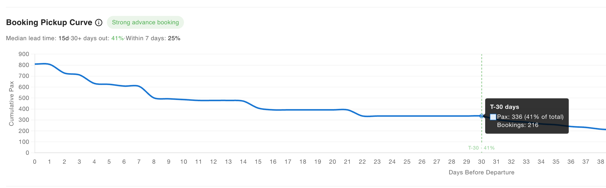
This chart shows how far in advance your customers commit to booking. It is essential before deciding whether early-bird discounts or last-minute incentives make sense for your business.
The x-axis shows days before departure (0–60), reading left to right as time approaching departure day. The y-axis shows cumulative pax booked at each point. The chart is aggregated across all tours in the selected period.
Three milestone lines mark key thresholds:
| Milestone | Colour | What it marks |
|---|---|---|
| T-30 | Green | 30 days before departure |
| T-14 | Amber | 14 days before departure |
| T-7 | Red | 7 days before departure |
A diagnosis chip summarises your overall pattern: Last-minute heavy if ≥70% of pax book within the final 7 days; Strong advance booking if ≥20% of pax book 30+ days out. If your pattern falls between these thresholds, no chip is shown and the raw milestone percentages are your guide.
How to read it
| Signal | Healthy curve | Last-minute curve |
|---|---|---|
| First bookings arrive | 45–60+ days out | ~14–22 days out |
| Shape | Gradual slope from the left | Flat → steep rise near day 0 |
| Forecasting | Can plan guides and bikes weeks ahead | Uncertainty until the last moment |
| Revenue visibility | Predictable | Higher risk of under- or over-supply |
There is no single "healthy" benchmark for all tours. A walk-in Sunset Waterfront tour that fills on the day is a valid business model. A Full Day Adventure that needs minimum numbers to justify van hire must fill two weeks out or the departure may not run. Interpret your curve against the operational requirements of each product.
That said, if you want a benchmark for a tour that requires advance planning: aim for 30–40% of seats sold by T-14.
What your curve tells you about pricing rules
Your pickup pattern directly informs which rules to use and when:
- Flat until T-7, fill is low — an early-bird discount might help confirm runs earlier by giving customers an incentive to commit in advance. Allow 3–4 weeks after introducing it before drawing conclusions, and only on tours running at a steady weekly cadence.
- Flat until T-7, fill is high — early-bird discounts are not changing customer behaviour. Customers are booking last-minute regardless of price incentive. Removing the discount is unlikely to affect fill rate and will improve margin.
- Strong early bookings, seats remaining near departure — last-minute premiums and capacity pricing are well-suited here. You can price up as departure approaches knowing demand will fill remaining seats.
TIP
If you are viewing Last 7 Days or Last 30 Days, the pickup curve will naturally look last-minute — there was not enough runway for advance bookings to accumulate. Use Last 90 Days or Last 12 Months to see a reliable view of your booking pattern.
Fill Rate vs Average Price
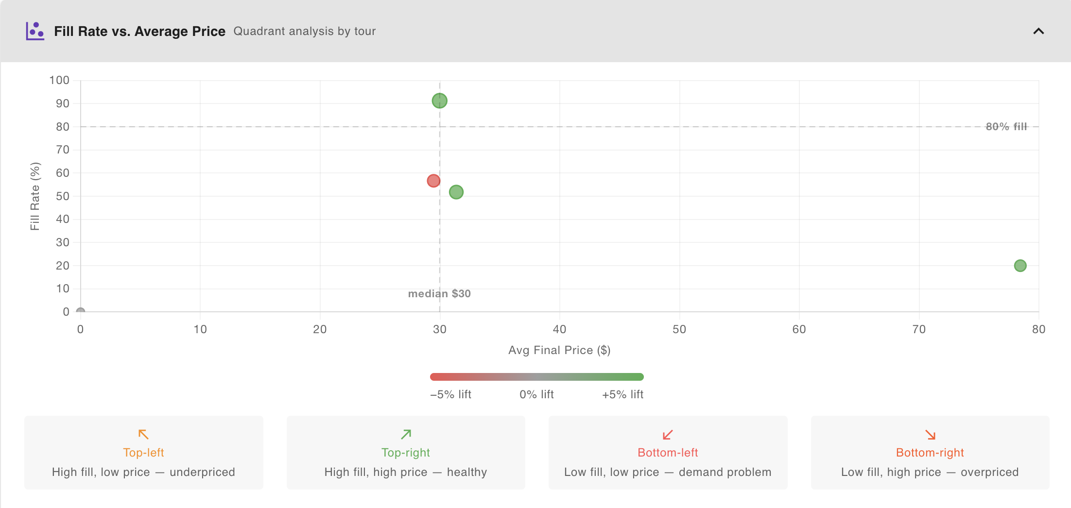
This scatter chart positions every tour as a single bubble in a quadrant grid. It is the fastest way to compare your full tour portfolio at once and identify which tours need a pricing review.
- X-axis — Avg Final Price ($): the per-seat price actually realised (including add-ons)
- Y-axis — Fill Rate (%): seats sold as a percentage of total capacity, 0–100%
- Bubble colour — Dynamic Lift: green = +5% or more above base, grey = near base, red = −5% or more below base
- Bubble size — proportional to total revenue generated in the period
Two reference lines divide the chart into quadrants:
- Horizontal line at 80% fill — the system's default high-fill threshold. This is not a hard performance target; whether 80% is the right goal for your business depends on your margins and minimum-to-run requirements.
- Vertical line at median price — the unweighted median final price across all tours shown. Tours to the right are above-median price.
The four quadrants
| Quadrant | What it means | Where to investigate |
|---|---|---|
| Top-left — High fill, low price | Filling well but potentially underpriced. Demand is there. | Try a modest price increase and watch fill rate over 3–4 weeks. |
| Top-right — High fill, high price | Strong performance. Pricing and demand are aligned. | Maintain. Look for seasonality patterns that could support further optimisation. |
| Bottom-left — Low fill, low price | Demand problem. Price reductions have not driven enough bookings. | Pricing alone will not fix a demand issue — review tour visibility, channel distribution, or timing. |
| Bottom-right — Low fill, high price | Overpriced for current demand, or a niche product with naturally low volume. | Check Rule Impact for capacity or last-minute premiums that may be too aggressive. |
Reading bubble colour
Green = pricing rules are adding revenue above base price (positive dynamic lift). Red = discounts are pulling the realised price below base. Grey = rules are roughly neutral.
A top-left bubble with a red colour is the clearest action item in the whole dashboard: it's filling strongly, but active discounts are suppressing the price. Reduce or remove those discounts first.
Small samples
A tour with only 2–3 departures in the selected period can appear anywhere on this chart and mean very little statistically. If a tour looks like an outlier, check its Departures count in Performance by Tour before acting on it. Use a longer date range to give it more data.
TIP
Each bubble represents one tour, not one booking or departure. Tours only appear if they had at least one qualifying booking in the selected period.
On the Books
This section is your forward-looking triage list — upcoming departures that are currently underperforming on fill. Unlike the rest of the dashboard, which looks backward at completed bookings, On the Books looks forward at departures that haven't happened yet and still have time to act on.
It is collapsed by default. Open it when you start your day, not at the end of it.
Triage buckets
Departures are sorted into three urgency levels:
Act today (red) — These need a decision now. A departure appears here if it:
- departs within the next 48 hours, or
- departs within 7 days and is booking at less than 40% of its historical pace for this lead time.
Your options at this point are limited: a last-minute price reduction via Override Pricing, or cancellation if the tour clearly won't fill.
Watch this week (orange) — These depart within 7 days and are below 40% fill, but pace is not yet critical. This is your adjustment window. A modest price drop now can still move bookings before departure. Check these daily during peak season.
Monitoring (grey, collapsed) — Departures 8+ days out that are below 40% fill. Low fill at this lead time is completely normal for most tours — bookings are still arriving. Keep this section collapsed; it is background awareness rather than a to-do list. Expand it only when you want to plan ahead.
Reading the Pace column
Raw fill rate on its own is hard to interpret. A tour at 15% fill two weeks out might be completely normal for your business, or it might be a crisis. The Pace column answers that question by comparing where you are now against where you typically are at this same point for this tour.
| Pace label | What it means |
|---|---|
| 0 bookings — historically X% full by now | No bookings at all, and past departures of this tour were already X% sold at this lead time. This is the most urgent signal on the card. |
| Tracking at Y% of hist. pace | You have some bookings, but you're running at Y% of your usual pace. 50% means half the bookings you'd normally have at this point. |
| No historical data | No comparable past departures to benchmark against. This is common for new tours or recently added time slots. A low fill here may simply mean the tour hasn't run enough times to establish a pattern. |
A departure at 10% fill with "No historical data" warrants much less concern than one showing "0 bookings — historically 55% full by now."
Actions
Tap the ⋮ menu on any row to access:
| Action | What it does |
|---|---|
| Override pricing | Opens the schedule pricing panel. Set a departure-specific price — for example, a reduced price to stimulate last-minute demand. This overrides base and rule pricing for this departure only. |
| Cancel schedule | Cancels the departure. Any confirmed bookings will be cancelled and refunds processed automatically. Customers and the assigned guide are notified. Use this only when it is clear the departure will not reach minimum numbers. |
| Snooze | Hides this departure from the list for your current session. Use it after you've already taken action and don't need the reminder. The row reappears on your next session. |
Cancel is only available for Act today and Watch this week departures. Cancelling a departure 10 days in advance via this panel is possible but not recommended — use the full tour schedule management page for non-urgent decisions.
TIP
Snooze is session-only. If you override pricing on a departure and want to stop seeing it in the list, snooze it. It will reappear next session so you can check whether the price change helped.
When to use it
Check On the Books at the start of each operating day, before anything else on the dashboard. It takes 2–3 minutes: work through Act today rows first, then scan Watch this week for anything that has shifted since yesterday. Ignore Monitoring unless you're planning ahead.
If Act today is empty and Watch this week has nothing critical, close it and move on.
How it all works together
The five sections work as a diagnostic workflow. Here is how a real pricing review flows — from identifying the issue to understanding why it's happening and deciding what to do.
Step 1 — Find the tours that matter
Open Performance by Tour. Sort by RevPAS or Empty-Seat $ to find your biggest opportunities. Look for:
- High Empty-Seat $ → significant revenue upside if you can improve fill or hold price
- Negative Dynamic Lift on a high-fill tour → discounts firing unnecessarily
This gives you a shortlist of 1–3 tours worth investigating further.
Step 2 — Place them in context
Open Fill Rate vs Average Price. Find your shortlisted tours on the scatter. Confirm which quadrant they sit in — this tells you whether the problem is price (too high or too low) or demand (too few customers regardless of price). A bottom-left tour needs a different response than a bottom-right tour.
Step 3 — Understand why the price is where it is
Open Rule Impact and check which rules are running at high utilization. Remember: Rule Impact is global across all tours. To connect it to a specific tour, look at that tour's Dynamic Lift column in Performance by Tour and compare the sign and magnitude against the Rule Impact totals.
Step 4 — Check booking timing before changing rules
Before adjusting early-bird or last-minute rules, check the Booking Pickup Curve. If your customers book last-minute regardless, removing an early-bird discount is very low risk. If bookings arrive steadily weeks out, last-minute premiums have natural support.
Step 5 — Track the effect over time
After making a change, monitor Price vs Fill Rate Over Time weekly. Look for the Final Price line to move in the direction you intended while fill rate holds steady or improves. Allow 3–4 weeks of data on tours with a weekly cadence before drawing conclusions.
Worked example
You open the dashboard on a Monday morning, Last 30 Days selected.
Performance by Tour shows your Historic City Tour: Fill % 91% (green), Avg Price $28, RevPAS $25, Dynamic Lift −12%. High fill, negative lift — this tour is filling without needing a discount.
You check Rule Impact: Group Discount is firing at 68% utilization. Almost every booking is triggering it.
You open Fill Rate vs Average Price: Historic City Tour is in the top-left quadrant, red bubble. Confirming: strong fill, below-median price, discounts dragging it down.
You check the Pickup Curve: it shows 75% of pax booking within the last 7 days. No advance-booking behaviour to protect with an early-bird.
Decision: raise the Group Discount minimum from 4 to 6 participants, and test removing the early-bird entirely on this tour. Check again in 4 weeks.
Common patterns
| You see… | Likely cause | Where to confirm |
|---|---|---|
| Tour in bottom-right quadrant | Overpriced or niche demand | Rule Impact — capacity or last-minute premiums too aggressive? |
| Tour in top-left with a red bubble | Discounts firing on a tour that fills without them | Rule Impact → utilization of Group Discount and Discount Code |
| Pickup curve flat until T-7, fill is high | Last-minute walk-in market — no advance incentive needed | Compare against tours with earlier booking patterns |
| Pickup curve flat until T-7, fill is low | Consider a modest early-bird to confirm runs earlier | Allow 3–4 weeks after introducing before evaluating |
| Negative Dynamic Lift on a high-fill tour | Over-discounting — rules giving away margin unnecessarily | Performance by Tour → Dynamic Lift; Rule Impact → Utilization |
| RevPAS flat while Avg Price rises | Fill rate dropping as price goes up | Price vs Fill Rate Over Time — watch both lines over the same period |
| Final Price ≈ Base Price despite active rules | A premium and discount of similar size are running simultaneously | Rule Impact → check for rules cancelling each other out |
How often to review
- Daily — open On the Books first thing. Check Act today and Watch this week. Takes 2–3 minutes.
- Weekly during peak season — 15 minutes on Monday to catch any tours with Fill % trending down or Dynamic Lift going negative.
- Monthly in shoulder season — a deeper 30-minute review comparing Rule Impact month-over-month and checking the Pickup Curve for any shift in booking patterns.
- After every pricing rule change — check Price vs Fill Rate Over Time 3–4 weeks later to confirm the change had the intended effect.